FILTER

INTRO
In another life, Jonathan took my very first headshots for my singing career. Years later, when he saw on LinkedIn that I was designing Squarespace websites alongside my photography work, he asked if I’d be interested in collaborating on a few projects. He was running his photography and video studio, iso800, but finding himself building more and more websites and needed a reliable partner to take on the build. That was the start of a brilliant working relationship, and I was thrilled when he asked me to jump on board with a brand-new project: Filter.
ABOUT FILTER
Filter is built around a simple idea: "the ease of an agency with the dedication of an independent freelancer." Jonathan acts as the filter between the client and the specialist freelancers needed for each job. Naturally, this new venture needed its own online home, and that’s where this journey started.
Filter grew out of the natural expansion of iso800. With Filter taking the lead on complete visual strategies for sustainable businesses, iso800 can return to its roots in dedicated photography and video production. Depending on the scope of each brief, Jonathan brings together hand-picked specialists (from brand designers to web developers) to create one cohesive, beautifully aligned visual identity. The client gets the benefit of an entire creative team guided by Jonathan, without ever having to juggle multiple freelancers themselves.
WHAT Jonathan NEEDED
Because this was an initial launch, we agreed to roll out the website in clear, manageable stages:
Phase 1 | One-page flagship website
Phase 2 | SEO Kickstart setup
Phase 3 | Expansion into a multi-page site with a dedicated blog
Phase 4 | Full ecosystem digital strategy
For this first phase, Jonathan needed an online presence that was bold and creative, but also worked hard as a practical tool for his business:
A clear conversion path: A straightforward way for potential clients to get in touch or book an introductory chat without any friction.
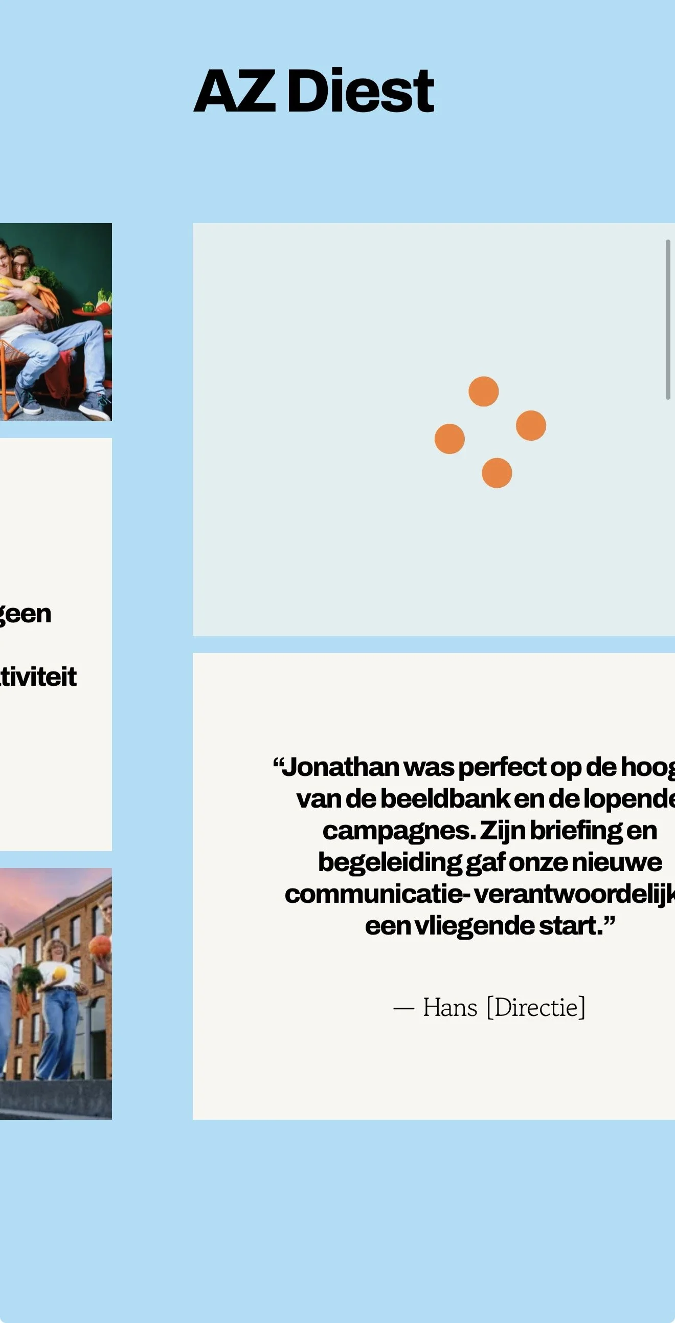
Rock-solid mobile performance: A site that loads fast and handles cleanly on phones and tablets, so prospective clients don't drop off before reading the story.
A stress-free backend: A setup simple enough for Jonathan to update case studies, swap text, and add new team members in minutes, without ever worrying about breaking the layout.
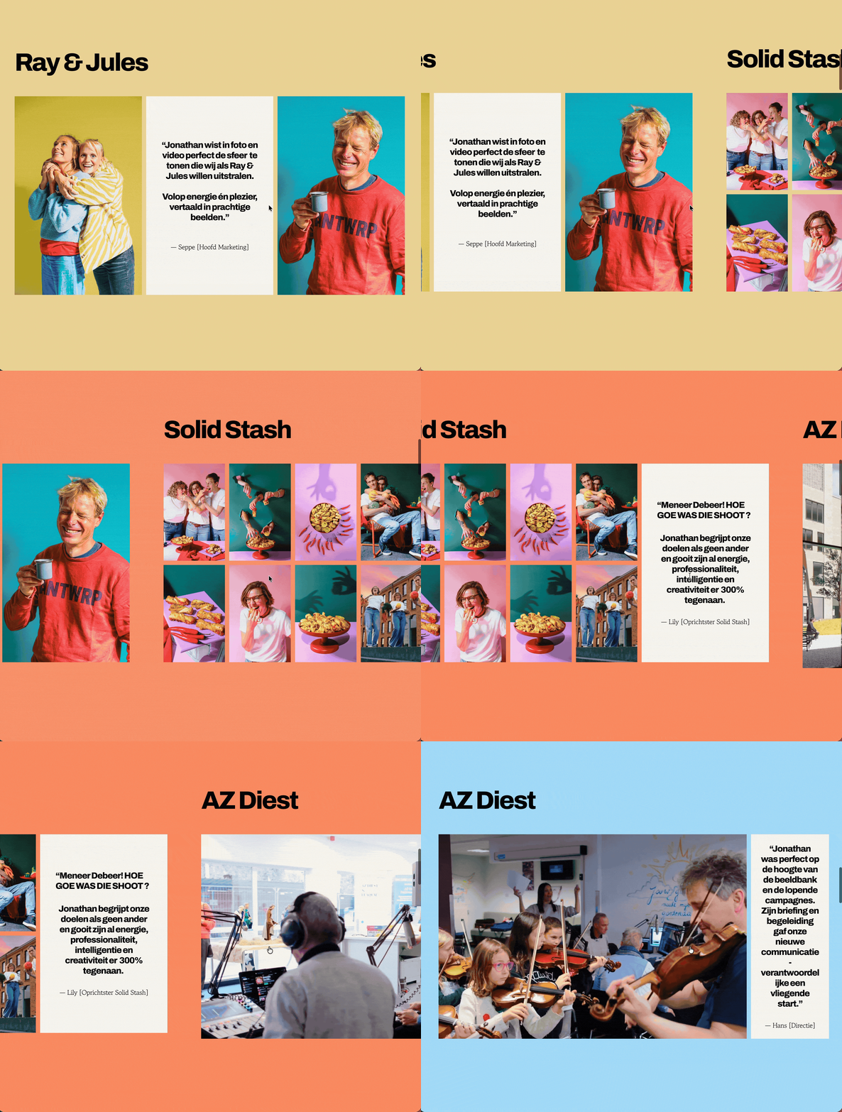
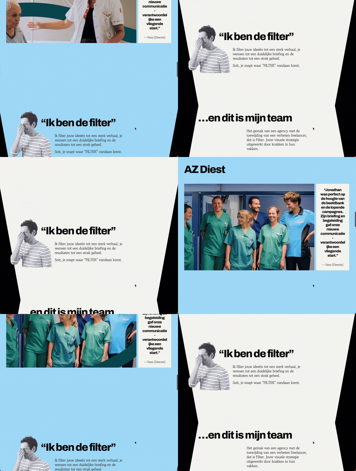
A unique browsing experience: A smooth horizontal scroll instead of a standard vertical page, giving the feeling of moving through an interactive presentation rather than a standard template.
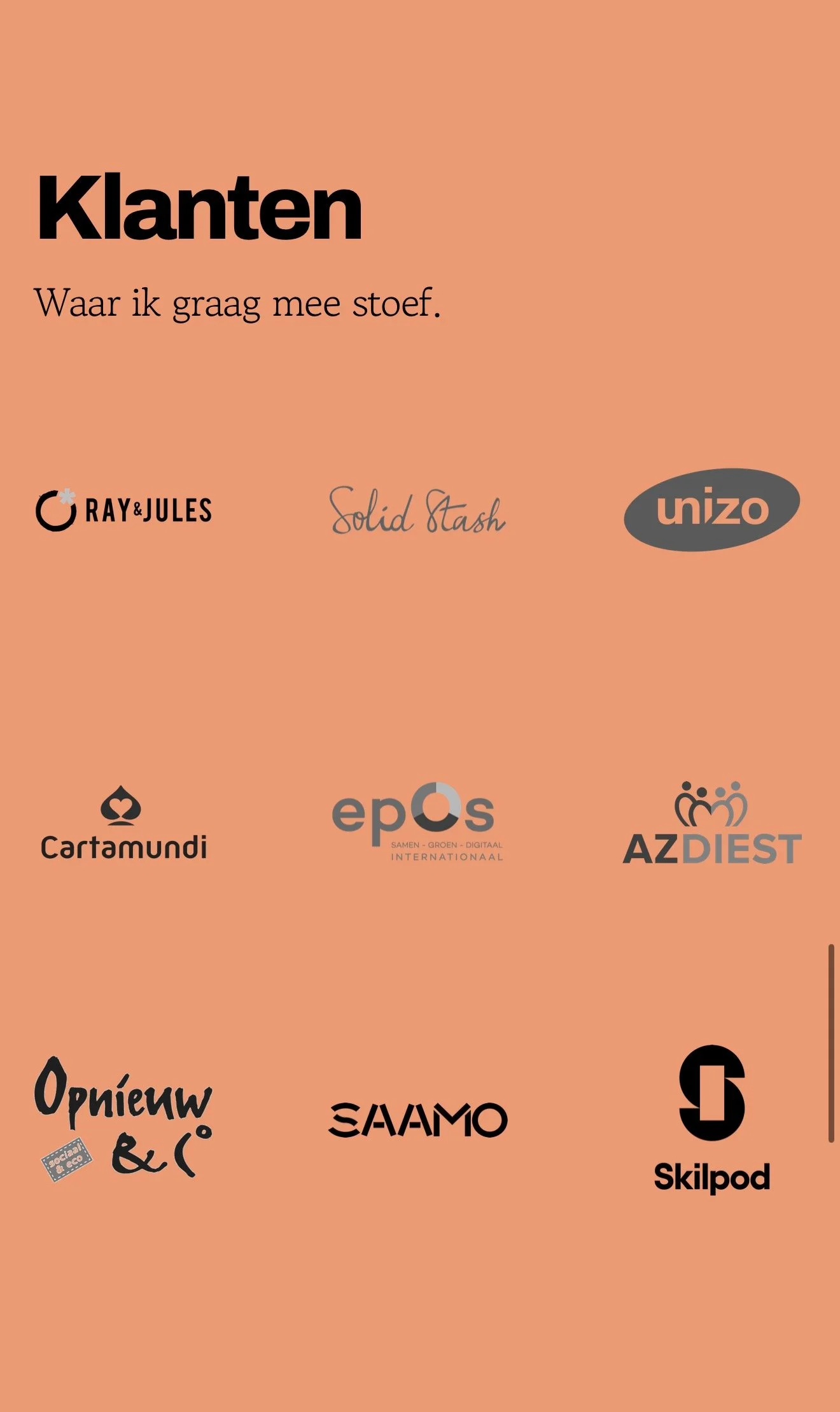
Dynamic colour changes: Gentle background shifts that fade naturally between brand colours as you move across different client projects.
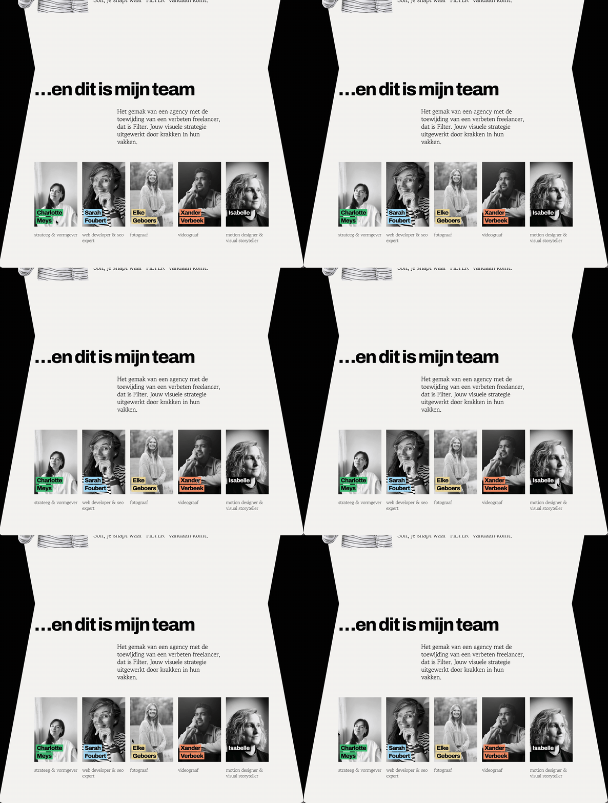
Interactive elements: Bespoke cutout buttons and an engaging team showcase that feels modern and tactile.
The main design challenge was making sure all these creative ideas didn't get in the way of usability. A website can have all the motion in the world, but if it feels clunky or stutters on a laptop trackpad, visitors leave. My job was to keep the movements completely fluid while making sure the core message stayed front and centre.
WHAT I CREATED
Working from Charlotte Mey’s striking brand identity, I built a custom Squarespace site designed to let Filter’s work take centre stage while giving visitors a seamless, intuitive experience.
Effortless Enquiries & Booking:
I integrated straightforward contact points and clear calls to action directly into the flow of the page, ensuring anyone looking to start a project can reach Jonathan in a couple of clicks.
Smooth, Natural Browsing:
Rather than letting the continuous horizontal layout cause lag or slow down older devices, I built the animations so the browser handles transitions effortlessly. The result is a smooth, gliding feel across the page with zero sticky trackpad stutter.
Fluid Background Colour Shifts:
As you move through the site, the background shifts softly between Filter’s brand colours to match each client showcase. The transition happens naturally behind the content without distracting from the reading experience.
Interactive Details:
I created custom cutout buttons where the text acts like a stencil, letting the background colour shine through as you hover over them. For the team section, I adapted a standard layout so desktop visitors get quick details on hover, while mobile users get an intuitive, swipe-friendly view.
Complete Independence:
I organised the backend so Jonathan doesn't need to call me every time he wants to add a new project or change a line of text. The entire structure is protected, allowing him to keep the site fresh without touching a single line of code.
Highlights
Built for real client conversions: Clear, easy booking and contact buttons designed to turn visitors into enquiries.
Bespoke horizontal layout: An engaging, presentation-style scroll that feels fresh and memorable on both desktop and mobile.
Fluid background colour changes: Subtle colour transitions that highlight individual client stories as you scroll.
Interactive, cutout styling: Custom-crafted buttons with moving shapes that react naturally to the cursor.
Mobile-optimised team area: A clean showcase designed for easy swiping and tap-to-reveal details on smaller screens.
Fast, reliable performance: Optimised asset loading so images appear cleanly without jumping or freezing.
Solid SEO foundation: Built-in page titles, clean heading hierarchies, image alt tags, and custom metadata so Filter gets found properly on Google.
Burnout-proof handoff: A clean backend setup that lets the team manage updates internally in minutes.
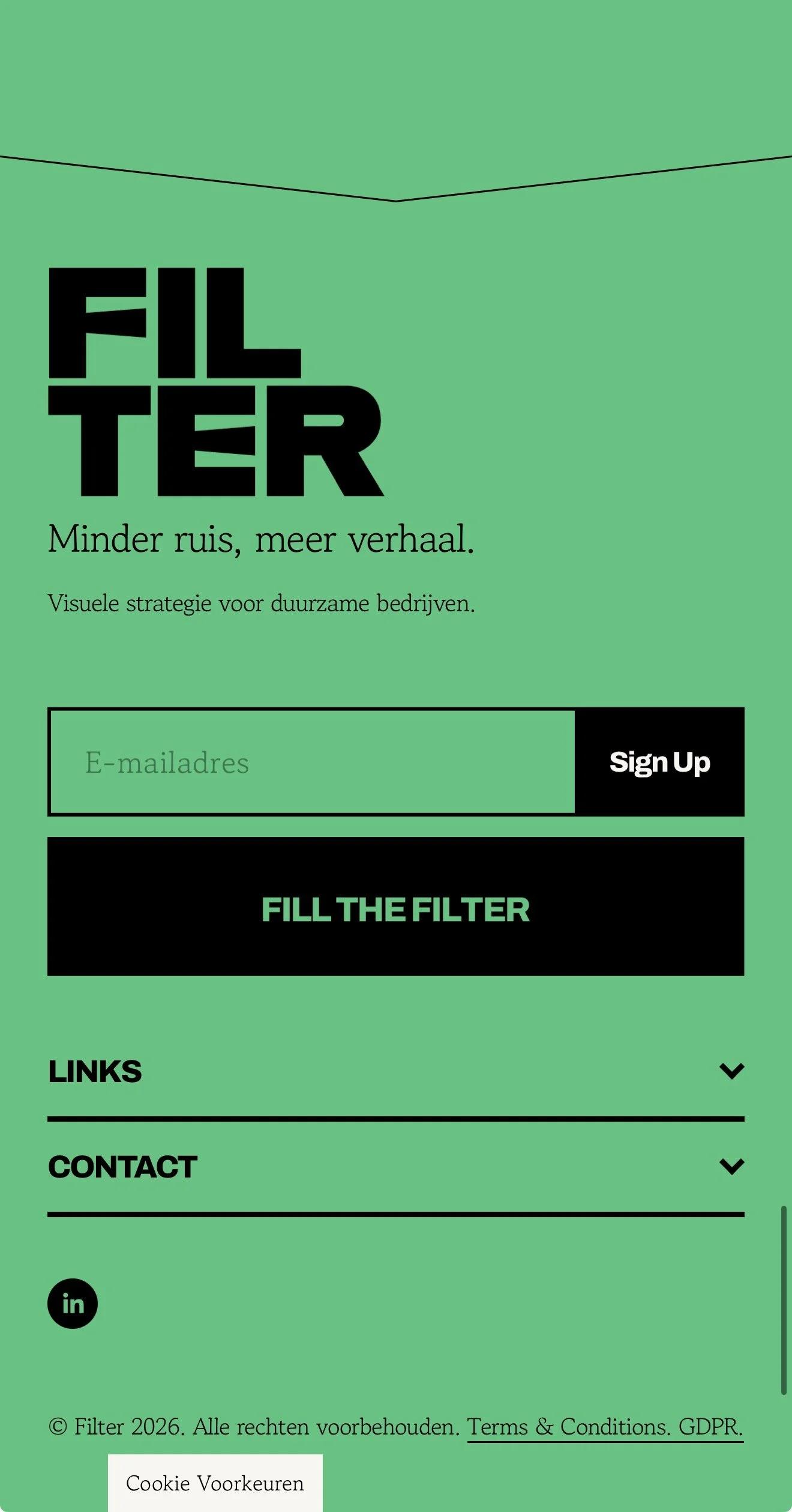
Less noise, more story: a clean, interactive Squarespace home for Filter.



Fullly Optimised & Tested to run smoothly on Mobile
WHAT Jonathan SAID
“(quote coming)”