
DIY | Library | Menu
Learn how to edit your Squarespace CSS menu with easy-to-use code. This guide covers desktop and mobile tweaks using accordion blocks for simple navigation.
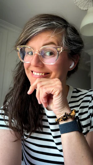
Sign up to read this post
Join Now
Learn how to edit your Squarespace CSS menu with easy-to-use code. This guide covers desktop and mobile tweaks using accordion blocks for simple navigation.
I’m a photographer and Squarespace web designer based in Altrincham, South Manchester. I specialise in portrait, landscape and opera photography and also offer a “complete website package” where I can offer headshots, photos of your business and design your new website so you can manage it yourself afterwards.
Over the years I’ve built a portfolio career as a professional photographer, opera singer, wardrobe assistant and singing teacher. I have a MMus from the RNCM, a Bachelor in Theatre Sciences and Musicology from Ghent University and I’m a qualified teacher. When my son was born in 2021 I quickly realised that an opera career wasn’t as compatible with being a mum as much as I would like, so I decided to change my focus completely to photography and web design.
I prefer working with daylight in casual surroundings while having a chat making sure you’re at ease and relaxed. It’s the little moments in between that make the best shots!
Feel free to get in touch if you’d like to work with me!